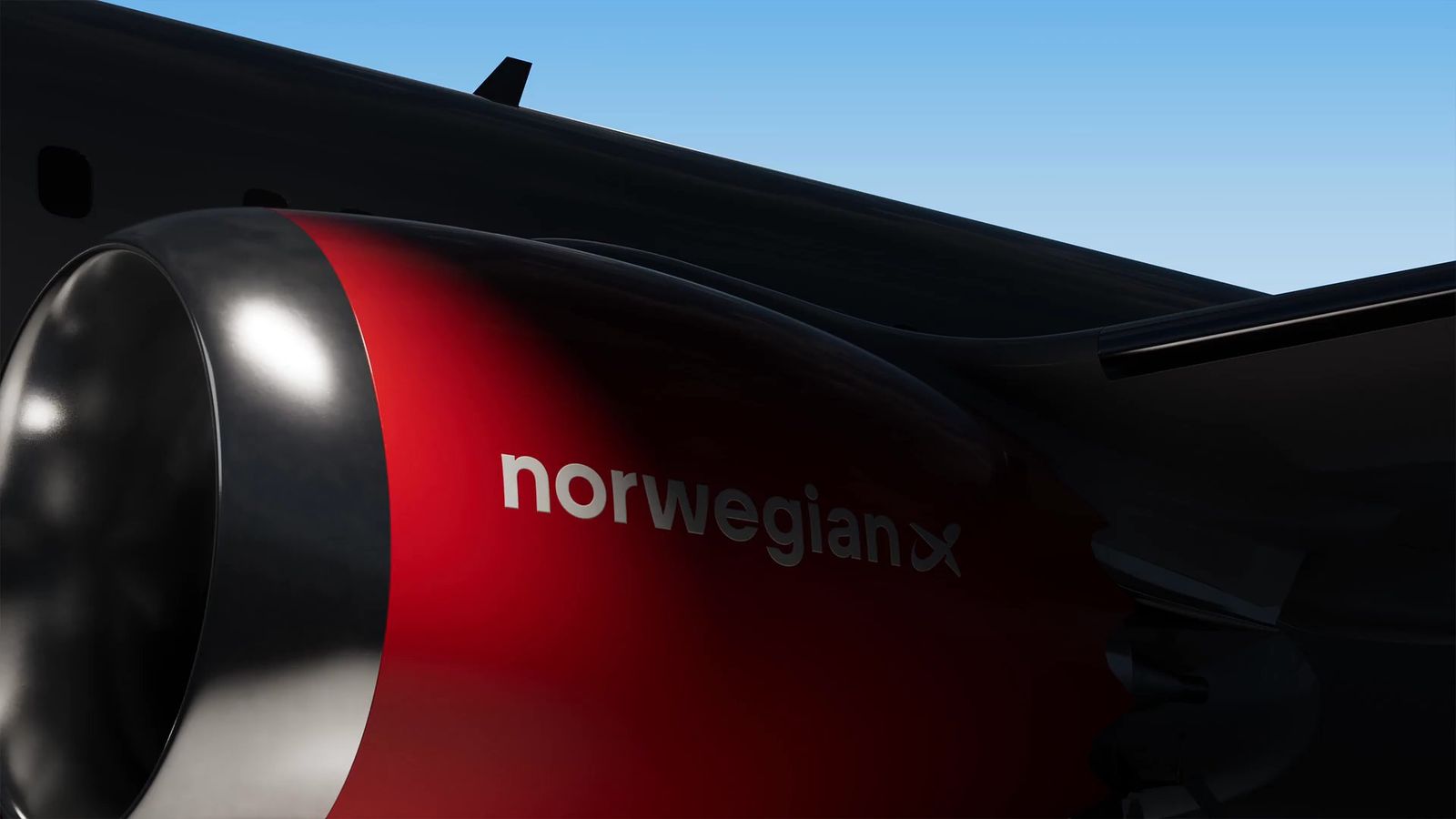
No dialogue or sound. A red aircraft engine cowling carries the norwegian wordmark against a blue sky.
Norwegian
The Norwegian Way
After COVID reshaped aviation, Norwegian needed more than operational recovery. We helped Norwegian define "A Fair Price Airline" and translate modern Norwegian values into a cohesive brand platform that works globally.


The challenge
Norwegian had built strong recognition as a disruptive force in aviation, backed by more than 20 years of brand equity. Post-COVID required evolution: from purely Norwegian to internationally relevant, from rebellious startup to responsible airline. The task was preserving a distinctive edge while opening new markets.
The solution
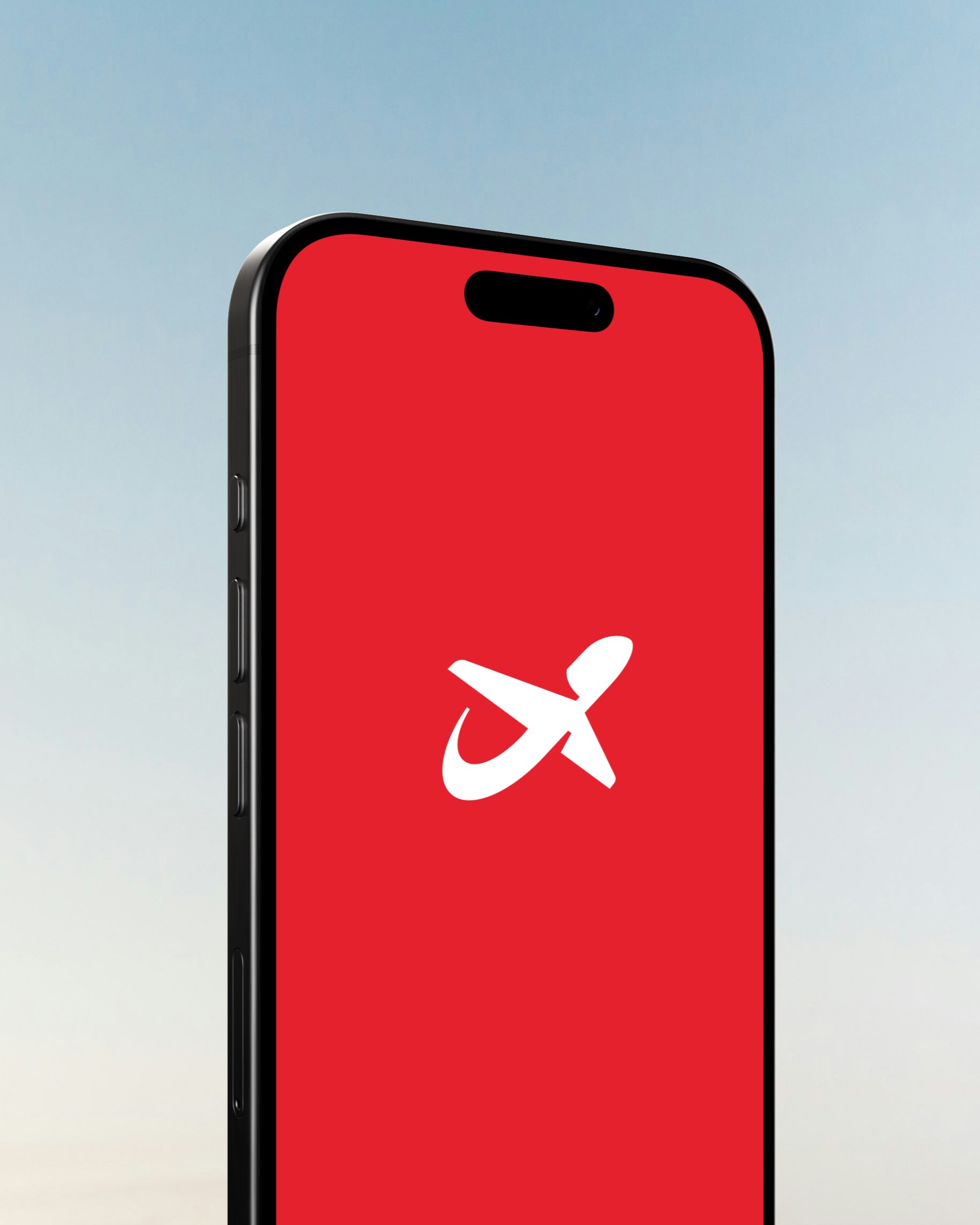
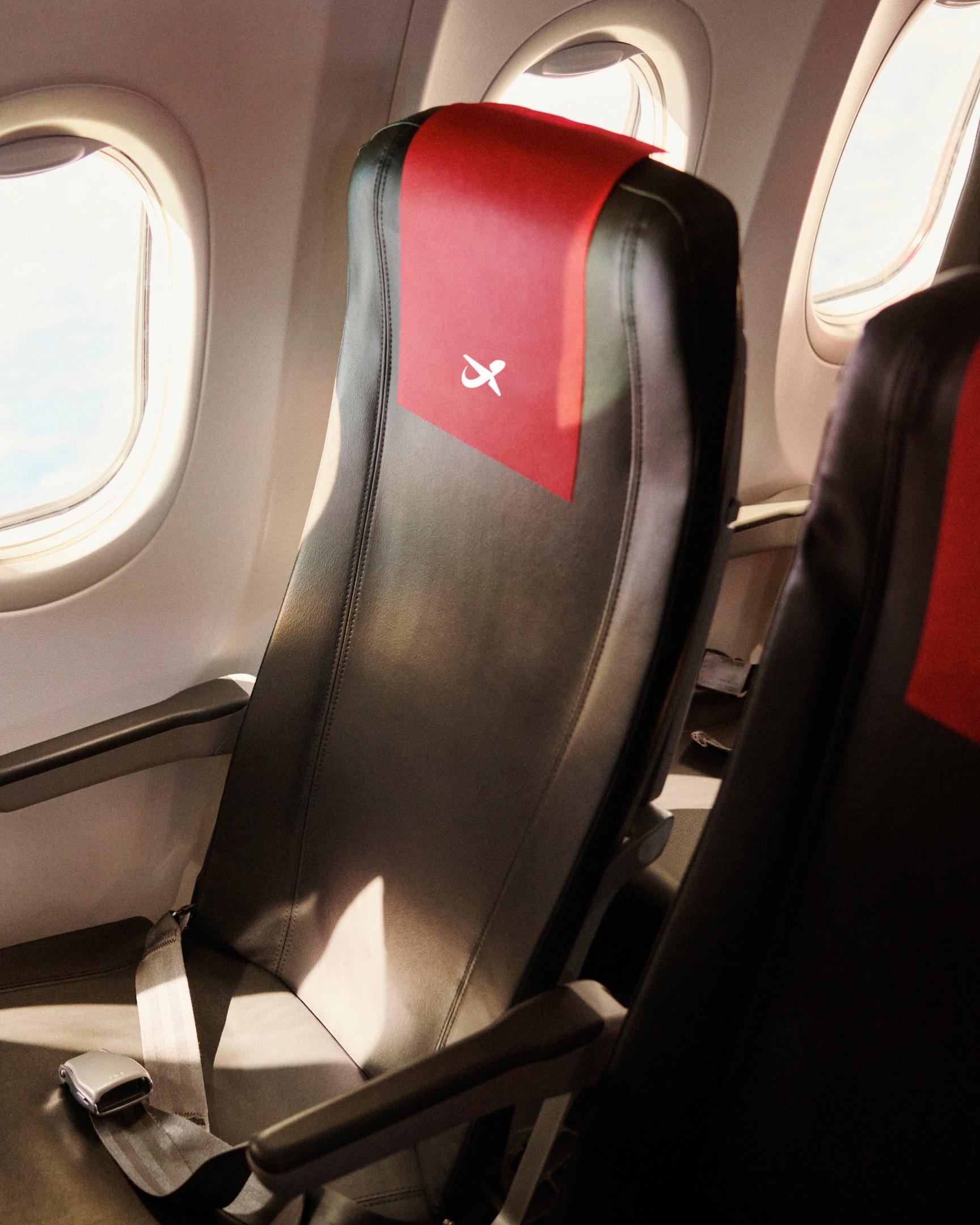
The rebrand centers on The Norwegian Way, a concept that translates contemporary Norwegian principles into universal appeal and moves beyond traditional Nordic stereotypes. The visual identity changed to preserve: the iconic aircraft silhouette and flag colors stayed, while typography and digital applications were modernized.
The result
Within a year, brand tracking in several Scandinavian markets showed Norwegian owning emotional drivers like responsible, smart and value for money more effectively than competitors. Recent brand studies confirm strong, diversified recognition across Nordic markets, with the redesigned logo and red aircraft nose ranking highly against major carriers.




No dialogue or sound. A phone lies on a wooden table in dappled light. Its red screen scrolls through a list of destinations in white type, including Reykjavik, Athens, Budapest, Gdansk, Hamburg, Helsinki, Istanbul and London, with one name highlighted at a time.
No dialogue or sound. A silver suitcase covered in stickers turns in the air against a pale sky, alternating with a red airport screen that reads Boarding, flight DY762, London, 17:00.


No dialogue or sound. A run of vertical social story frames in red, navy and white with large type, including We wish we were Danish, Fly with us to Cairo, City Breaks, Ski & Snow and Cabin Crew Ready. Are you?, alongside travel photographs and flat illustrations.
No dialogue or sound. A vertical digital screen on a tiled wall in dappled light cycles through three ads: Autumn sale over a rocky coast, Thousands of discounted tickets! and All routes on sale with a Book now button, the last two on red and burgundy stripes.


No dialogue or sound. A phone on a navy background shows the Norwegian app, with a Low Fare Calendar card above a red button carrying the Norwegian symbol.
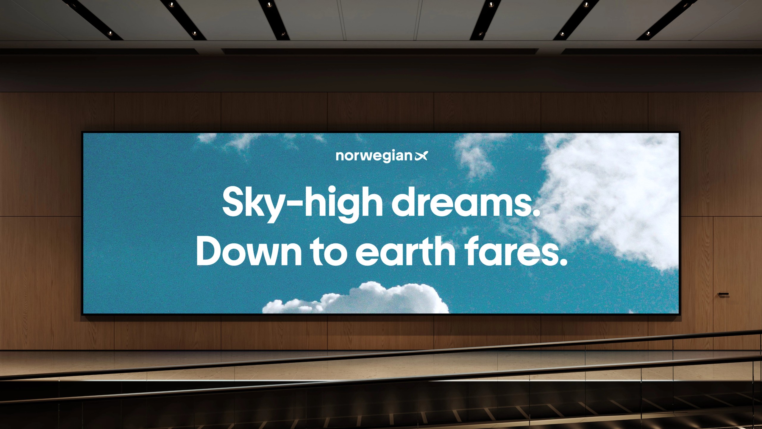
Staying authentically Norwegian while becoming genuinely international.
Credits
- In collaboration with Kanon Foundry
- Typography