Hafslund Eco
New Horizons
Hafslund Eco moved from a familiar B2C electricity retailer to a purely B2B company with two roles: an industrial pioneer producing clean hydropower, and an innovation company building tomorrow's smart cities. Though the merger was new, the company's history reaches back to 1892. The new identity needed to carry that duality, built to last, using nothing carried over from either merged brand.
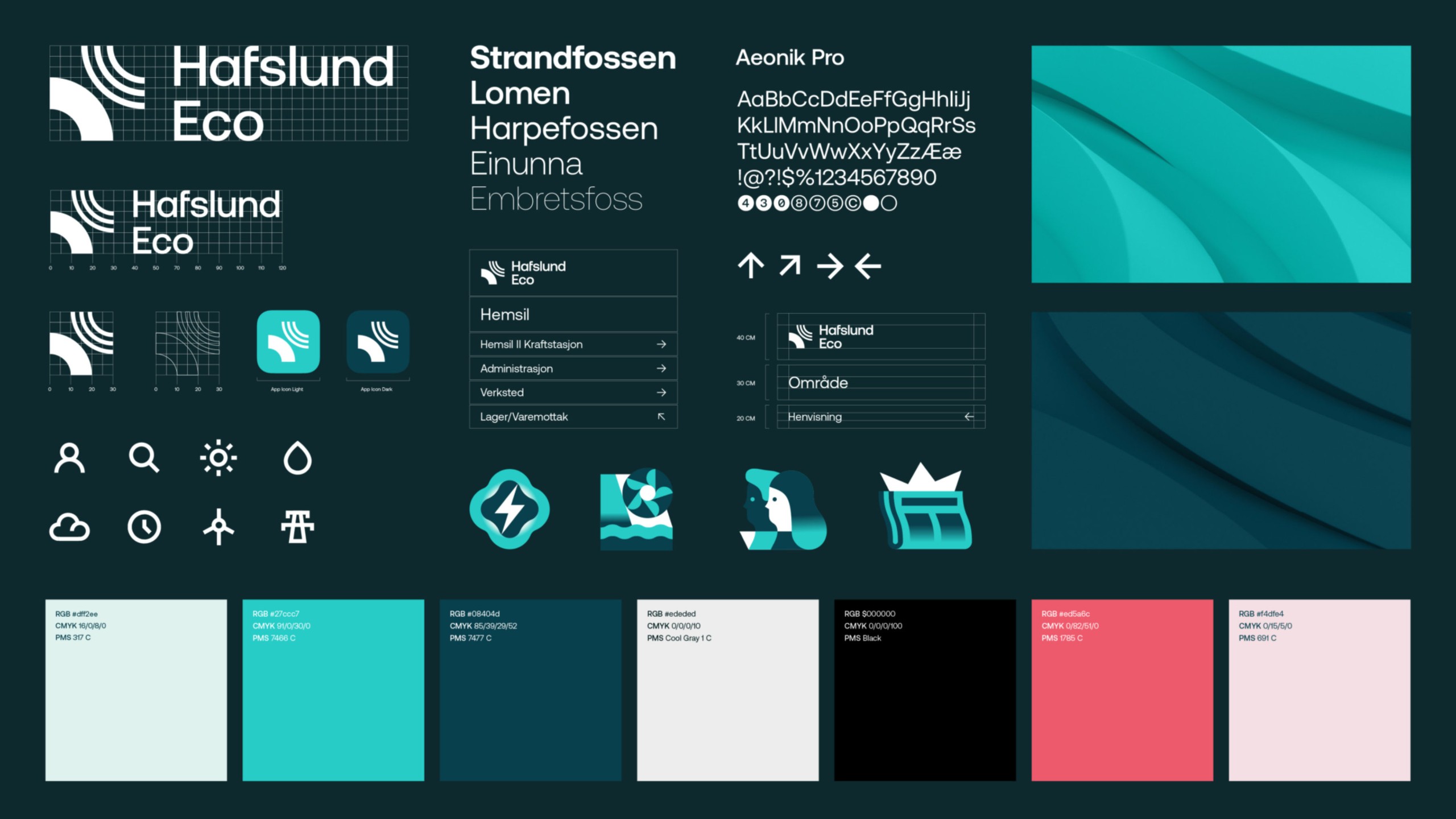
The New Horizons identity: logo construction, iconography and a colour palette drawn from the horizon.
Challenge
Hafslund Eco went from a familiar B2C power and grid company to a purely B2B company with two roles: an industrial pioneer in clean hydropower, and an innovation company for tomorrow's smart cities. The merged company's history dates to 1892, present at the first hydropower plants and the first electric streetlights, and now present as Norway builds a fully electric society.
Solution
The new identity had to hold the new strategy and build pride internally by reflecting the company's dual nature: history and future, industry and innovation, nature and urbanity. The result, New Horizons, is a logo that is simultaneously a reflection and a contrast, with a colour palette drawn from the horizon: cool tones from glacier and water against warm tones from the sunrise. It could not carry over any visual element from either merged company.
- Tonje Jæger
- TRY Design