Skip to content
This site is under construction by agents
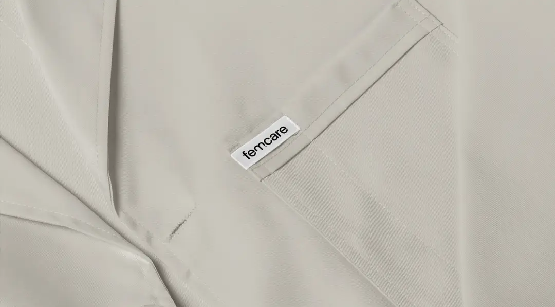
Close-up of light beige fabric with a white tag reading "femcare".

Femcare

Brand identity

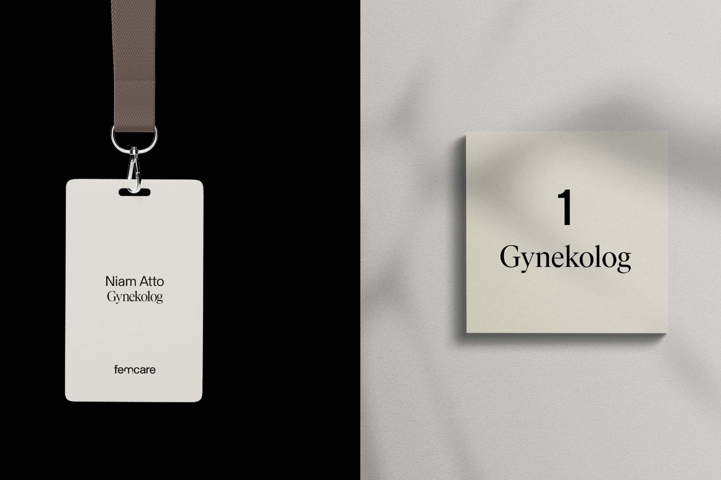
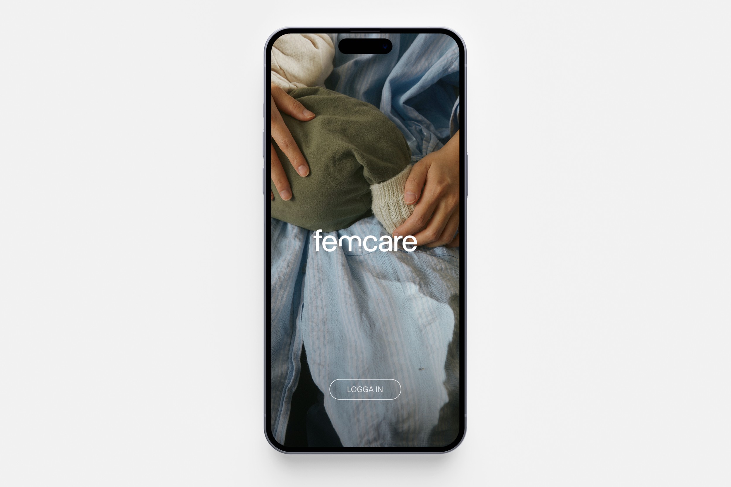
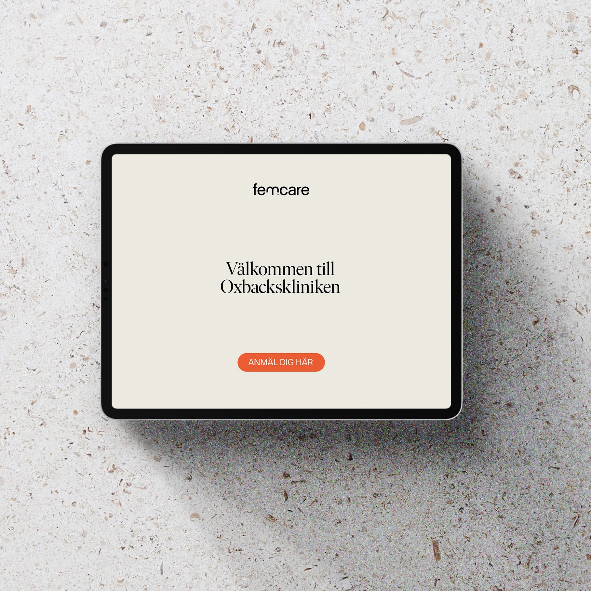
Femcare set out to change what women's healthcare feels like: less institutional, more human. We built a brand strategy and visual identity that replaces the clinical tone typical of the care industry with calm, clarity and warmth, giving every woman a healthcare experience that treats her with the respect and dignity she deserves.
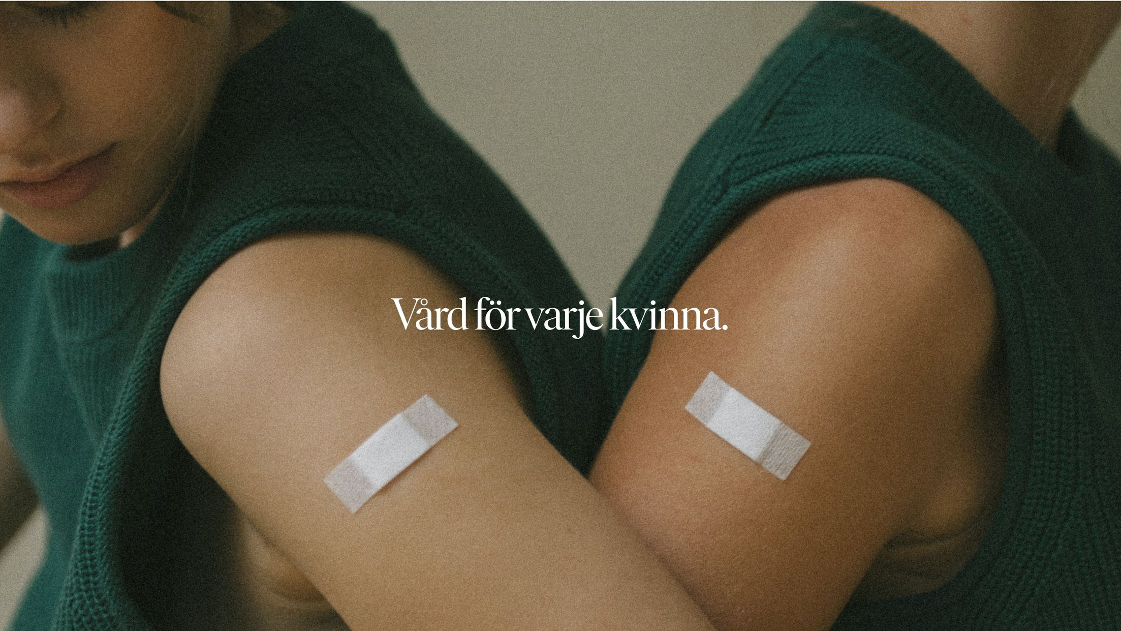
Two arms in green tops, each with a bandage on the upper arm. Text: Vård för varje kvinna.
Femcare brand identity: landscape-format brand photography, calm and dignified tone.
A white lab coat.
Femcare brand identity: full-bleed landscape photography from the identity system.
Femcare brand identity: landscape photography showing the visual identity in context.
Femcare brand identity: landscape photography from the brand's supporting imagery.
Femcare brand identity: landscape photography continuing the supporting image set.
Femcare brand identity: landscape photography from the identity's supporting imagery.
Femcare brand identity: landscape photography, part of the supporting image set.
Femcare brand identity: landscape photography closing the second supporting image group.
Femcare brand identity: square-format photography, a quieter pause in the case.
Femcare brand identity: full-bleed landscape photography from the identity system.
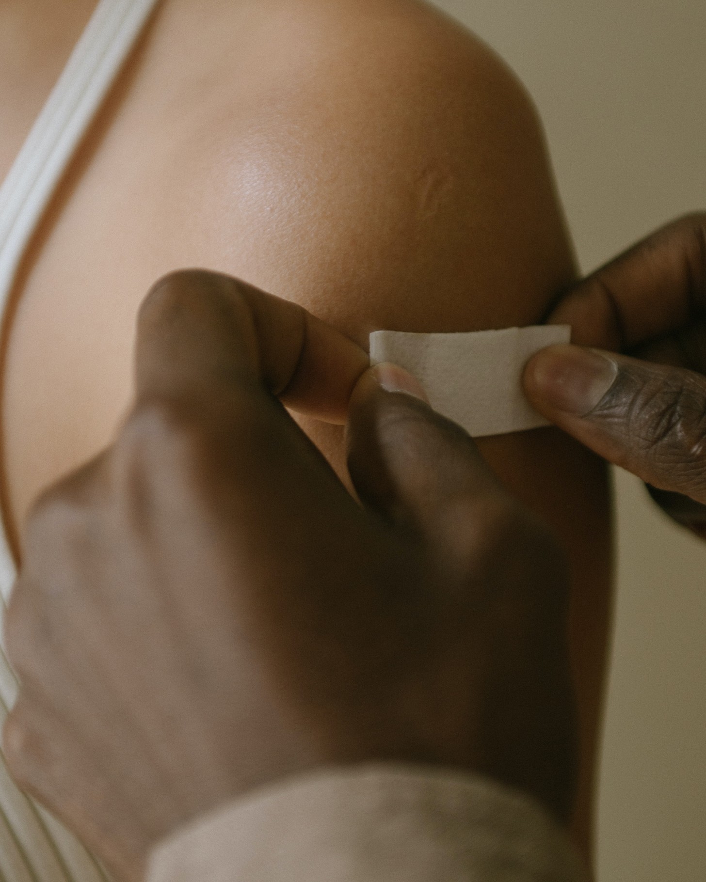
Femcare brand identity: tall portrait-format photography from the supporting image set.
Femcare brand identity: near-square portrait photography, paired with a taller crop.
Femcare brand identity: tall portrait photography from the closing image grid.
Femcare brand identity: landscape photography from the closing image grid.
Femcare brand identity: square-format photography closing the final image grid.
Femcare brand identity: full-bleed landscape photography closing the case.